Since 2020 we have created one Special Edition Diary cover each year, in addition to our Classic cover design. We work with our good friend and type expert Catherine Nippe to develop the designs for the special edition and each year she presents several options which make the most of that particular year's number — for example, certain typefaces have a great '2' while others have a particularly distinctive '6.'

For 2026, we settled on Void and Söhne Schmal Buch, after some debate. The aim was to have just one 'special' typeface, but in the end we decided for our 10th birthday year to splash out and have two! Initially, when Catherine presented 'void' Amy was not at all keen — but this was based on how the roman letters appear in words, not on the numbers (which in this case is all that matters!). And once Catherine explained her rationale, Amy was sold — the letters look like metal cast type, much like the metal die used to print our diary covers, so the design speaks of the making process itself.

As Catherine explains,
"The juxtaposition of the text pages and cover works beautifully in the Mark+Fold diary, balancing understated interiors with a bold and expressive exterior. The inside pages are designed as a flexible system, structured yet open to intuitive interpretation, allowing each user to shape the diary according to their own working style.
In contrast, the cover acts as a statement piece, whether placed on a desk, carried into a meeting, or easily spotted in a bag. Typography has always been central to the special editions, and for 2026, the starting point was the general silhouettes of the numbers 2 and 6. The flow of their curves and the tension along their edges strongly influenced the typographic direction.

For the Fluorescent edition, we used Söhne Schmal Buch from Klim Type Foundry, printed in white against an energetic fluorescent green background. This modern condensed sans, with its even stroke thickness and balanced curves, creates a satisfying rhythm of lines and spaces. Conceptually, the form of the “6” subtly echoes the shape of a paperclip, a humble yet iconic piece of stationery.

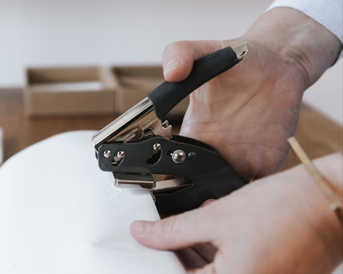
The Linen edition features Void from Optima Typefoundry, a geometric sans rooted in brutalism yet executed with refinement. Its sharp tension and controlled curves balance stark minimalism with quiet warmth, giving the diary a modern and assertive character. The interplay between Void and the tactile book cloth enhances the materiality, allowing the foil embossing to shine with particular beauty. There is also a conceptual nod to the mechanical processes behind printing and embossing, the bolts, screws and precision of the machinery, reflecting the hands-on craftsmanship at the heart of the Mark+Fold brand.