'Losing my diary would be worse than crashing the car!'
At Mark+Fold we like to talk to people about a shared passion for stationery, and this informs our designs. In 2017, we decided to develop our first Diary. So, we spoke to people about how they use theirs, and found that diary users feel passionately attached to, and dependent upon, this organisational tool. In one case, we were told that losing it would be “worse than crashing the car.”
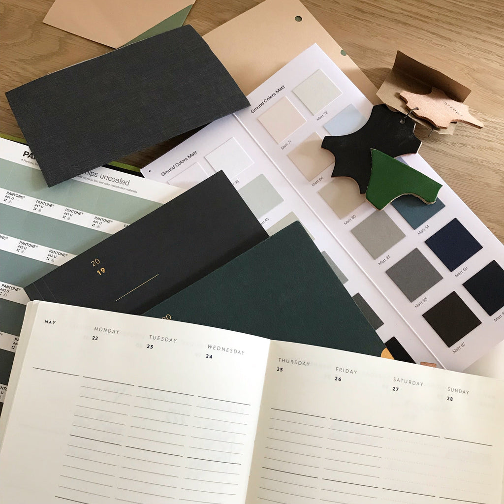
This article explains our design process: the principles that informed the design, and the research that led us to them (both our own initial hunches and anecdotal notions, through what diary users actually told us, and some observations about existing layouts).
Principles for a Mark+Fold Diary
Having thought about this for many years, we had some existing hunches about what would work best. In 2016, we threw the net out to the Mark+Fold community to gather some general opinions, and then did some more in-depth interviews with a few customers who held strong opinions about what a diary should, and should not, do. The following Principles were a distillation of this research:
-
Less Ink
We should put less ink on the page than the person using the diary! And what we do put down should feel “light”.
-
No ‘gumph'
At the start or end of the diary we omit all the world time zones, religious holidays, etc.
-
No wasted space
White space should be beautiful and / or useful. We should value the diary, the pages, the space (and respect the time it represents), as much as the person using it.
-
Compartmentalise!
It’s fun to write in different boxes: long tall ones for lists, short fat ones for reminders etc. Combinations of lines / grids / dots / blank, etc.
-
Reinforce the visual picture
People store a visual image of the week in their minds. We can help reinforce this in their memory, eg. by pulling out the ‘am’ and ‘pm’ or distinguishing the weekends from weekdays.
-
Play with typography
This is our own objective: to have fun and create something simple and beautiful. We can play with emphasising the date (19) / or the day (Monday) and the interplay between the two.
-
No repetition
It is not necessary to repeat, for example, the month (September) more than once on a spread.
-
No “pointers”
We want to leave it upto the diary user to decide what to write and where, so we avoid anything like ‘to do’ or ‘notes’.
-
Beauty is on the inside
Diaries are functional things and for some people an essential tool, so the inside pages deserve our primary attention (the cover will follow).
The background research
A number of different threads led us to these principles. It was a combination of these that helped strengthen our vision of what the Mark+Fold Diary should be, and really encouraged us to believe that there was a need for this new kind of layout.
Anecdotal assumptions
We have to admit that we had some assumptions before we began. These are some of the things we were concerned about:
-
The elephant in the room: nobody uses diaries anymore, because everyone has iCal (or something along those lines).
-
We assumed that people use diaries less than they used to.
-
Given we know that a lot of people use paper notebooks, we thought that a diary would normally act as a secondary tool to back up the notebook and / or digital devices.
-
We thought people would like something slim and lightweight, so they didn’t have to lug a big book around with them.
There is a little bit of truth in all of these points, but what we found when we spoke to people was far more enlightening and exciting.
“It's not that I use a diary because I am an organised person. It is because I am disorganised and couldn’t cope without it!”
What we learned from diary-users
-
People that use diaries, love their diaries. One person went as far as to say “If I were to lose my diary it would be worse than crashing the car”.
-
Several of the keen diary users use it instead of a notebook, and it is the basis of all of their ‘action’ lists or ‘to do’ lists as well as telling them where they need to be and when.
-
People tend to see a diary as an investment, as they use it so much; and they often keep them years afterwards.
-
Often used in conjunction with a digital diary, the paper diary is the “master copy” and only the diary owner is “allowed” to write in (or read) it. One person described the diary as “protecting” them in contrast to a laptop where people can bombard you with things that are beyond your control. The diary, in contrast, is a private space.
-
Several people said that they use a diary not because they are an organised person, but because they are disorganised and could not manage without it; some talked about it “training” them to remember things and to structure priorities or actions for the day / week.
-
Diary users are aware of the value of the diary, both in terms of money spent and of the environmental impact of using up pages. So there is an awareness of space not to be wasted (perhaps implicitly the time that this space represents, too).
Some observations about other products on the market
-
Many do not use space efficiently, with awkward areas of white space which are too small to be useful.
-
Some info is taking up space but of little use.
-
Some info is repeated (eg. saying ‘September’ more than once on a spread).
-
Sometimes what works graphically or numerically (eg. dividing the page into 8 even squares) does not work in terms of planning your days, or reinforcing a mental picture of the week.
The Mark+Fold Diary is born
We first launched the Mark+Fold Diary in November 2016, and are pleased to have gained new converts every year since. Customers appreciate the fact that we provide a clear structure without being prescriptive. And of course, our diaries are produced to the same exacting standards as our other products — beautiful, sustainably-sourced papers, and our special layflat binding which makes the diary flop open perfectly flat.
Each year we use a slightly different cover colour to differentiate one edition from the next, and since 2019 we publish several different options each year. Customers can pre-order the Diary from summer onwards and we love to see the same names cropping up year after year.
—
Shop Mark+Fold Diaries + Planners


