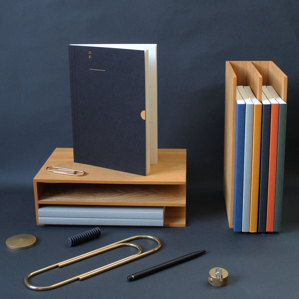
Since we published our first Mark+Fold Diary in 2017, the question of next year's cover colour has been an annual source of great debate within our team, and great suspense among our loyal diary customers. Part of our process this year was to ask ourselves to recap the story so far, and so we thought it would be fun to share this with you.
The 2026 Diary colours will be announced at midday on 27 August 2025, with pre-order customers and members of our Stationery Subscription receiving a sneak preview before everybody else.
Given it's our 10th Birthday year, we have a few treats in store...
Enjoy 20% off when you pre-order 2026 Diaries and Planners before 5th September

2017 : Cobalt Blue
At this point, we had only a very small range of notebooks (in black and sand). Mark+Fold was just a year old and we were still trying things out, so doing a diary felt like a really exciting addition. The navy blue felt classic and this particular paper from G.F. Smith has a lovely muted tone to it.

2018 : Racing Green
Continuing with just a single colour option for 2018, we went for Racing Green. This deep, rich grey-green was such a beautiful combination with the matt gold foil. That year we also printed the text on the pages in a matching grey-green Pantone.

2019 : Flint
This was the moment when we discovered our beloved Flint, made in Cumbria from used coffee cups. As many of you will know, this is now used on our Everyday Notebooks and has featured on various other editions, as it's such a beautiful hue. The story of how it's made from post-consumer waste ticks all our boxes.

2020 : Our first Special Edition
Still wanting to continue offering people an understated classic option, we felt it was time to offer something a little more bold as well, and so came our first Special Edition. Working with our friend and collaborator Catherine Nippe, we developed a Futura-esque abstract '2020' comprised of only semi-circles and straight lines. The half 'zeros' bleed off the right hand side of the page, making reference to our trademark thumbcut motif.

2021 : Introducing the beloved Mustard
When it came to choosing colours for 2021, we looked to the studio pinboard where we collect things that we find pleasing and inspiring. A postcard from Brat restaurant in London (black foil on mustard), and an Ally Capellino bag in mustard with black trimmings. Serendipitously, we had recently discovered a new paper made in the UK from used coffee cups, and it came in this gorgeous rich shade of mustard. We had an incredible response to this image when we posted it on instagram in September 2020, and mustard continues to be one of our most popular colour choices.

At Mark+Fold we always like to offer an understated, 'quiet' option in contrast to the generally over-decorative style of stationery on the high street. And so came Black. Not just any black, but the black card made with 30% cotton which we used on our first ever notebook (The Mark One) back in 2015.

And while we were at it, why not a third option too? This mist and neon combination felt right — there is something about a muted, natural tone combined with neon that really makes it sing.

2022: The arrival of linen
2022 saw our most special Special Edition to date. We went all out. Not only was this a limited edition in linen, it was our first hardback diary, hand-made at Wyvern Bindery in East London and then screen-printed in Bromley. We had such fun with these, it was a chance to really celebrate the art of print and binding.

2023: Blue and white
Inspired by the blue glass bottles Amy collects at home, 2023 was the year for bold rich blue offset with crisp white foil details.
2024: Moss
Chosen for its rich earthy colour, and its connection to the emotions that each season brings. From the rich hues of autumn, to the optimism that those first flashes of green bring in the springtime.

2025: Community Clothing collaboration
Alongside the usual classics, we collaborated with Paper Foundation and Community Clothing to create an innovative paper made 100% from denim scraps collecting in the cutting room at CC's jeans factiry in Lancashire. This beautifully tactile paper made a great cover for the 2025 Diary, featuring a bold modern '25' set sideways to draw attention to the echoing curves in the form of the '2' and the '25.
2026 Diary colour reveal
So what will it be for 2026? All will be revealed soon... As always, pre-order customers hear first and get first choice of colours. You can place a pre-order and enjoy a 10% pre-order discount upto Friday 5th September.
Enjoy 20% off when you pre-order 2026 Diaries and Planners before 5th September


