Since childhood, I had been a keen diary user and always loved the ritual of visiting my favourite stationery shop to choose one for next year. Over the years I had also kept a mental list of big-bears (from clunky layouts, to over-cluttered pages, and of course top of the list for any fountain pen user: poor quality paper!).
So in 2016, I was excited to embark on some research to find out if other diary users shared my views, and what indeed they would wish for in a Mark+Fold Diary should we decide to create one.
OUR DIARY DESIGN PRINCIPLES
1. LESS INK
We should put less ink on the page than the person using the diary! But what we do put down should feel ‘light’.
2. NO ‘GUMPH'
At the start or end of the diary we omit all the world time zones, international festivals and religious (as well as Bank) holidays.
3. NO WASTED SPACE
White space should be beautiful and/or useful. We should value the diary, the pages, the space (and respect the time it represents), just as much as the person using it.
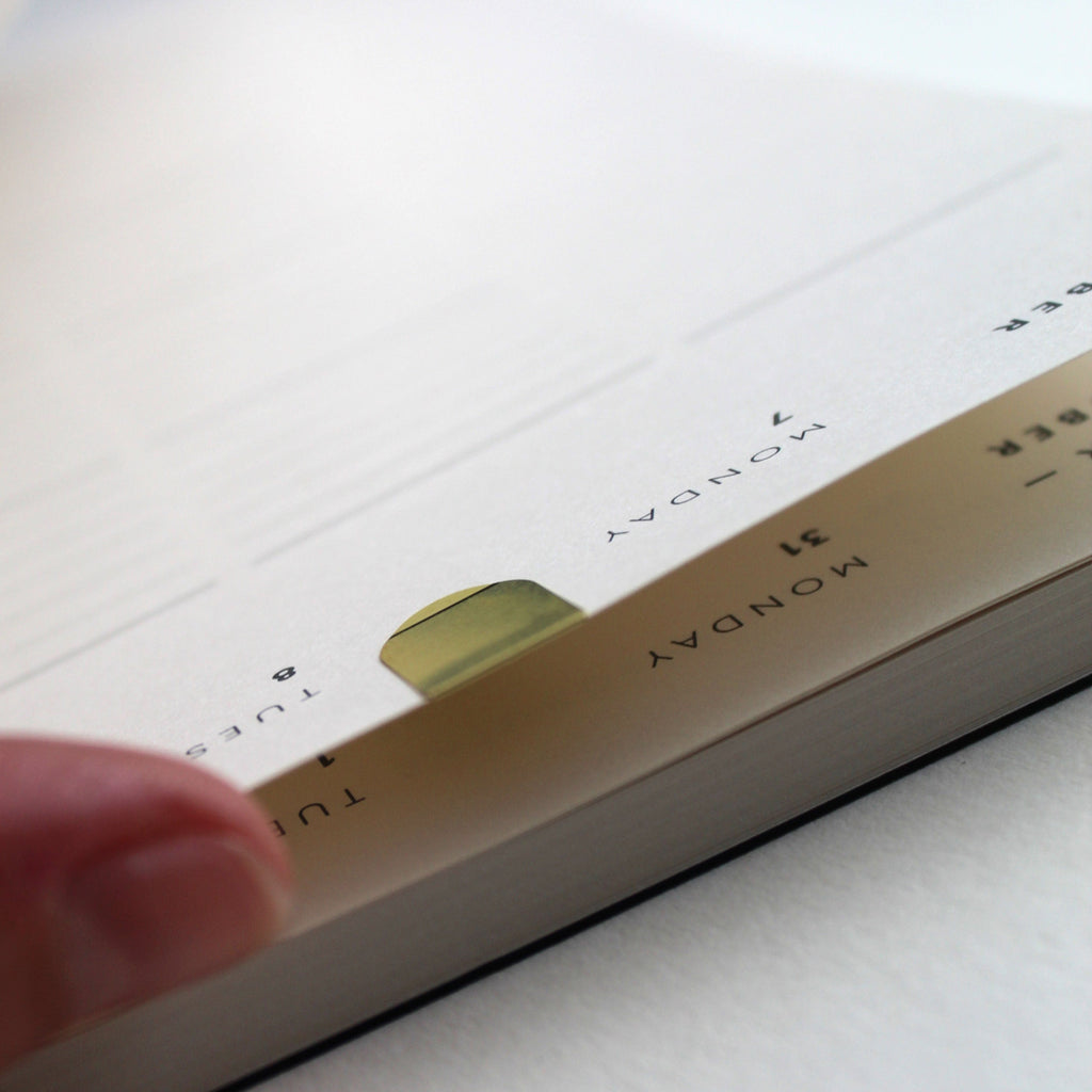
4. COMPARTMENTALISE
It’s fun to write in different boxes: long tall ones for lists, short fat ones for reminders etc. We incorporate combinations of lines / grids / dots / blank to give you the choice of where to scribble.
5. REINFORCE THE VISUAL PICTURE
People store a visual image of the week in their minds. We can help reinforce this in their memory, by pulling out the ‘am’ and ‘pm’ or distinguishing the weekends from weekdays. We’re not here to tell you what to do - we’re just offering you a user-friendly framework.
6. PLAY WITH TYPOGRAPHY
This is our own objective: to have fun and create something simple and beautiful. We can play with emphasising the date (19) / or the day (Monday) and the interplay between the two.
7. NO REPETITION
It is not necessary to repeat, for example, the month (September) more than once on a spread. You can use the space we’ve freed up for something less boring instead.
8. NO “POINTERS”
We want to leave it upto the diary user to decide what to write and where, so we avoid anything like ‘to do’ or ‘notes’.
9. BEAUTY IS ON THE INSIDE
Diaries are functional things and for some people they’re an essential tool, so it’s the inside pages that deserve our primary attention. The cover design will follow.


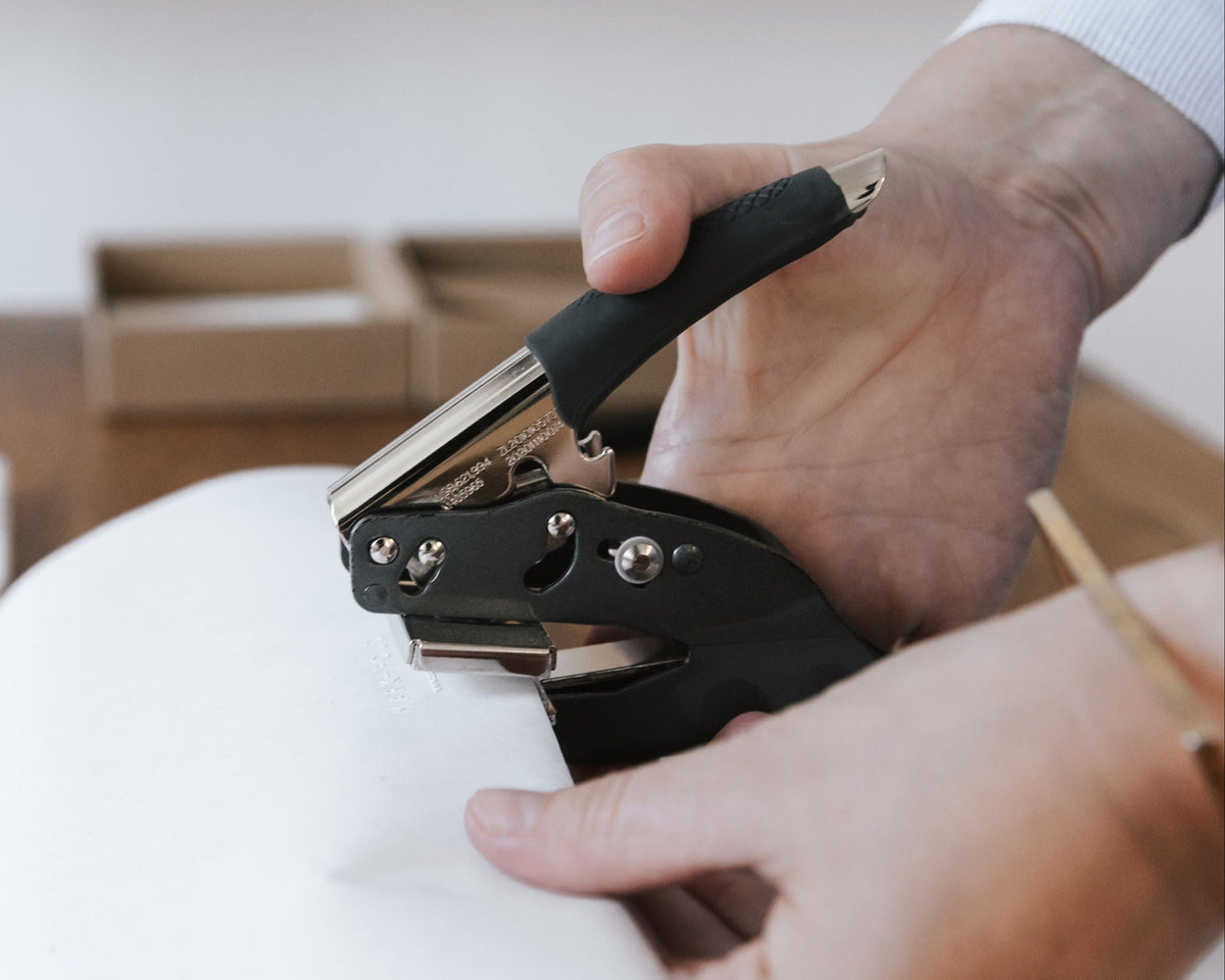
We launched the first Mark+Fold Diary in November 2016, and are pleased to have gained new converts every year since. Customers appreciate the fact that we provide a clear structure without being prescriptive. And of course, our diaries are produced to the same exacting standards as our other products — beautiful, sustainably-sourced papers, and our special layflat binding which makes the diary flop open perfectly flat.
Every year we make a slightly different set of cover colours to keep things interesting and create an attractive collection of past editions for your shelf. Customers can pre-order while the next edition is being designed, printed and bound. Many customers place their orders as early as January of the previous year — and we love to see the same names cropping up year after year. Guess we must be doing something right!

Join our mailing list to receive updates like this direct to your inbox.