In 2015, we set out to create a better notebook: not only would we improve the quality of the notebook itself, we would also improve the process to make it more considered and transparent.

THE BACKGROUND RESEARCH
As people who really appreciate good stationery, we were sad to see a declining quality in the notebooks we found on the high street. They would look great on the shelf, but after a few days' use you would notice that the paper was poor quality and allowed the ink to bleed through, or the binding was very stiff and it became tedious to have to 'flatten' the book every time you opened a new page to write. It felt like there were too many shortcuts and compromises in the finer details. We wanted something better.
Designs tended to be decorative and feminine, with nothing that really reflected our personal taste. We wanted something more simple, elegant and understated.
We also wanted to know more about where and how our notebooks were being made. And there was little or no information about the paper used, where it came from, whether it was sustainably-produced.
INSPIRATION
Meanwhile, we were seeing independent, creative brands in other industries like clothing and interiors, which were offering better quality, telling stories about materials and how things are made, and reflecting a more design-led, understated aesthetic, with a considered attention to details.
We started to imagine how this approach could be transposed onto the humble everyday notebook. It felt like the world saw stationery as something trivial and throw-away, but we knew it deserved more attention.
PRINCIPLES
Our design principles for the first notebook were a synthesis of many years worth of observations and ideas. These formed the essence of the Mark+Fold brand, which flows through the whole range, from notebooks to diaries:
— the notebook had to open perfectly flat without force
— the cover had to feel tactile and high quality
— the pages should feel wonderful to write on, be suitable for fountain pen, and be thick / opaque enough to avoid ink bleed-through
— we would tell the story of the materials, and every step of the making process
— we would have them made in small batches, to keep things human-scale, and avoid waste, and share this as another level of transparency

PRODUCTION
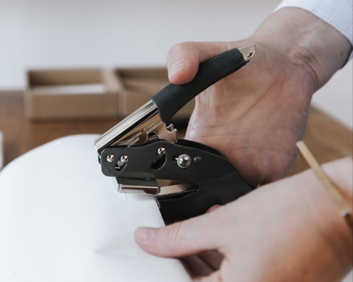
We spent six months sampling and refining the details. We kept being told "it would be cheaper if you did it like this instead." It was frustrating to keep hearing this theory that price is everything and quality is not important! We also saw samples claiming to be the kind of binding we were after, but on closer inspection they used hotmelt glues resulting in a stiff spine — these were books designed to be read, but not designed to be written in.
Eventually we found our team in the Netherlands, a family-run bindery who have been producing books for art publishers and graphic designers for decades, and were well used to our level of perfectionism. The partnership began in 2015 with our first notebook and has continued ever since.
LAUNCH
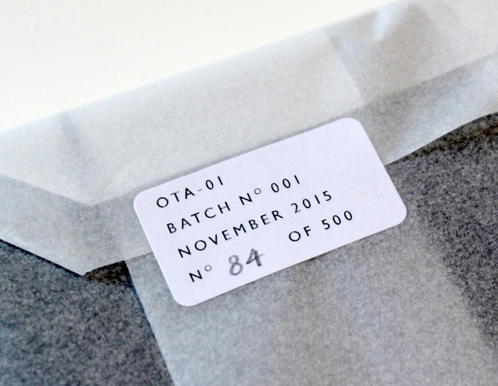
Our first batch of the Notebook Mark One was made in November 2015, just in time for the Mark+Fold launch. It is now popular with customers throughout the world from San Francisco to Seoul, and stocked by Fortnum & Mason in London.
Following the popularity of the Mark One, we created the Notebook Mark Two (lined pages) and in 2019 the Notebook Mark Three (dot grid pages). Keeping to the brand’s restrained use of colour and patten, the notebooks all share the same elegant, understated design. The covers are made from beautiful European-made papers, with subtle blind-embossed details and the Mark+Fold ‘thumbcut’ motif, which references the graphic device used on telephone directories and address books, suggestive of an invitation to “Turn the page” and “open the book.”