Every December, letterboxes of the world become the unwitting recipients of countless complimentary promotional calendars. You know the type. Flimsy ones from the nearby builder’s merchants, shiny ones from the local takeaway joints and questionable ones from the garage that passed your car’s MOT this year. Whilst we admire the gesture, it’s a sad fact that many of them just end up in the recycling bin, or worse still - end up actually being used because there was no time to find a better option!
At Mark+Fold, we like to take these useful everyday things as a starting point for a design brief. The questions we asked ourselves when we started the process were: “How can we make something equal parts beautiful and useful? Is there a way we can create an at-a-glance year planner that actually deserves to be pride of place on someone’s wall? What kind of design would turn the everyday task of organising a busy life into something genuinely pleasurable?” It took time (of course) but we believe we managed to generate the ideal solution by using the same rigorous approach as we use for every Mark+Fold product.

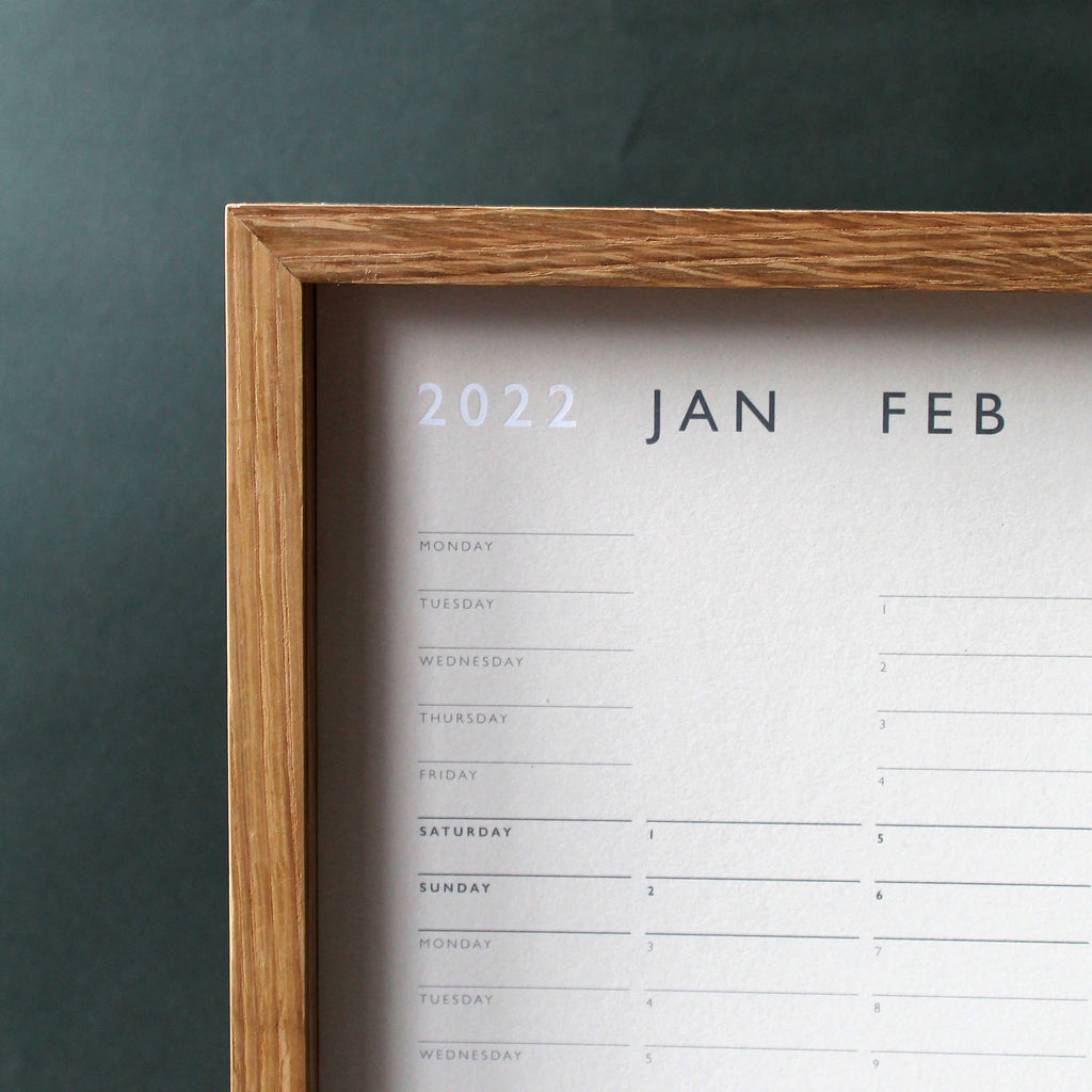
It also means it’s easy to see how many working weeks there are in any given month (Instead of having to run through the ’30 days hath September, April, June and November’ rhyme in your head). There’s also the added bonus that with a lighting speed glimpse, you can see which friends are lucky enough to have birthdays that fall on a Saturday. We really do think of everything!

With a subtle spotlight on the weekends, the first day of the month falls at differing heights across the calendar, which creates a kind of ‘graphic equalizer’ effect (a guaranteed warm, fuzzy feeling for the analogue music fans out there). We also made sure there was as much space left for your own writing, rather than filling the void with showy logos or fancy typography – because after all, this is your wall planner – not ours!

By sprinkling a generous helping of Mark+Fold dust, we think we’ve made a yearly wall planner that’s perfectly poised to bring a sense of place for all your hopes, dreams (and dental appointments). The layout makes it feel like deliberate décor – rather than necessary admin. Available framed or unframed, they are all printed in the U.K. as a limited-edition numbered batch of 200 copies. The 175gsm paper is made sustainability in Cumbria and litho printed and foiled. The interplay of dark grey ink and white foil on the off-white base really makes the combination of these two printing techniques ‘pop’. All you need to do now, is grab your favourite pen and get planning. After the chaos of Christmas festivities, is there any finer way to start the new year? We think not.